This book was a departure from anything else I had done. For starters it was the first book I had completed using photoshop, and it was one of the few books where I was happy with the reproduction in the finished book.This departure was partly out of necessity. I had just moved house when I commenced this project, and unfortunately my studio space had shrunk to half the size of the previous. I'm still currently working in this same space, and I long for the day I can afford a bigger house with bigger rooms to produce bigger pieces.
The less materials I am dealing with, the less room I need, so I came up with this simplified method of working. All I needed to create this art was a sheet of bristol paper, a nib, black ink and fine-tip pens, and my Mac.
The majority of work put into one picture, comes in the cross-hatching stage. So once this stage is done I have a picture that looks like this:
Then it's just a matter of scanning the image at 1200dpi, adjusting the threshold so the image becomes solid black lines on a white background. I select all the black lines in 'colour range', cut and paste into a new layer. Then beneath this layer I start adding in all my colour layers...
There's nothing complicated about my approach to photoshop. I don't try to emulate textures or brush strokes, I just use mostly flat colours. I figure if I want textures, I'll just do that the traditional way. I find it far more time-consuming and fiddly trying to mimic reality in photoshop, than actually doing it for real.
One thing I dislike about photoshop, is that the possibilities are virtually endless. Most people might find this an advantage, I don't — I actually like being restricted in certain areas. And if there are no natural restrictions, I'll create my own. For example, when I did this book I restricted myself to using just flat colour, and if I needed some sort of gradient, it had to be an unusual gradient, and not some crisp air-brushed gradient. I did the following background playing with halftone patterns, etc...
If I didn't set restrictions for myself, I'd be making tweaks to these pictures still! There is a tendency to over-produce to the point that it's just too much, and it becomes a mess, and Photoshop enables this. I'm guilty of it. I wish I drew the line with heaps of my stuff. But I hope I'm getting a bit better at knowing when to quit with a picture these days, more than I used to. Evidently, subtlety has not always been my forte...
This story was a challenge at first glance. I loved it, but I thought it was more suited to an anthology, accompanied by just one or two pictures, I didn't think there was enough to sustain a 32 page picture book. Reasons being, the story takes place in a short sequential period of time, mainly at night, the location barely changes, and the story has just two characters. I prefer stories that take place in several locations with a wide range of different characters, I don't like repetition. So when I first read this story, it seemed repetitive, not storywise, but in it's pictorial possibilities. So the challenge here was to make sure every picture was vastly different from the next. I achieved this by coming up with unusual angles and extreme close-ups...
Plus variations in colour...
The child (and narrator) of this story is not identified by name or sex, so I was free to come up with my own take on him/her. So I based the design of the child on my niece, Rachel...
She's a puckish little girl in real life, so I could see her matched equally to a marauding monster. And I couldn't star her in a book without making mention her brother, Carl. And while I was at it, why not throw in their family dog Winchester ("Winnie")...
There's a story behind the snake hanging out of her mouth, which was current at the time of drawing this picture. My brother found a brown snake in his shed at home. Not wanting to wrangle a dangerous snake, he called in a handler to remove it. By the time he arrived, the snake was nowhere to be seen. A few days later, my brother arrived home to find the snake dead, thrashed in half and lying on the driveway. He knew Winnie had got to it, and was certain he'd find her lying dead somewhere (not many dogs can kill a venomous snake and livc to tell the tale). My brother called out to her frantically, and in true Winnie fashion, she emerged slowly and timidly from under the house, the snakes blood visible on her white fur, with a look of 'did I do something wrong?'. Amazingly, she had killed the brown snake without being bit!
I should mention something about the design of the Pumpkin Eater...
The tricky balance here, was to have a character that is grotesque but still palatable to young readers. I suspect I might have failed here... The monster of the story is a nasty character, so I didn't feel he should be represented by a typical 'cutesy' monster. For one, essentially he dies at the end (ie. he's shot into space and blows up), so he can't be too pleasant, otherwise the reader will be sad to see that happen. My idea was to make the reader actually want to see him gone by the end of the book! If he looked liked Cookie Monster, it would be unforgivable to kill him off at the end!
Originally I partially based his design on a vulture, hence the scrawny naked neck and mane...
This feature was debated between myself with the publisher and author. They felt it was too ridiculous that he'd be swallowing such massive pumpkins down such a tiny neck. My argument was it is funnier, which was the whole point. The more ridiculous and impossible an idea is, the more I lean towards it. But that said, there is nothing more ridiculous than an anaconda swallowing a pygmy hippo (http://www.youtube.com/watch?v=VryQDsx5Ad8), so this idea really wasn't a stretch (pun intended). Nonetheless, I relented and did away with the neck. I could live with the change.
I'm fond of this book, and I was very happy with how it turned out. And as is the way, the books that I'm actually happy with, happen to be the least popular with the buying public. And with a print run of only about 2,000, it was never really given a fighting chance. This book is now out of print, but fortunately I have stocked up on remaining copies. If anyone wants to purchase this book (signed), drop me a line (whackothechook@internode.on.net).
Monday, July 19, 2010
Sunday, July 18, 2010
Tuesday, July 13, 2010
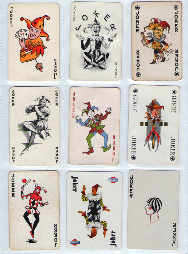
JOKER JOKER JOKER JOKER JOKER JOKER JOKER JOKER...
As a change of pace, I thought I'd share my collection of Joker cards. I've been collecting Jokers on and off for almost 20 years. This obsession started in high school when I found a lone tatty Joker on the bituman...
This is the one that started it all. I thought it looked pretty cool, so I carried it in my wallet for years. I couldn't say whether or not Brian Froud
actually drew this or authorised it, but it's an almost identical copy of a character from one of his illustrations in Master Snickup's Cloak
. This Joker is quite common.
The following two pages are very common. I get sick of finding these. I have far more doubles than what's shown here...
The Joker down the bottom of the next one page has got to be the worst, dodgiest one from my collection. Clearly the head is taken from the top one, but is that Sonic The Hedgehog's body? Makes sense...
I've never kept a running total of money spent on this hobby, that would be sobering. I'm not as obsessive about collecting as I used to be. I used to dedicate whole Saturdays driving around every antique shop and op shop in search of new Jokers. I wasn't always greeted with hospitality when asking cranky biddies to open cabinets so I could flick through a dozen decks of cards. Though others are quite amiable and understanding, and even offer to call me if they find anything of interest. These days I tend to just buys decks as I come across them, instead of actively seeking them and dedicating too much time (and money) to it. A lot of my Jokers have been donated too, since it is usually the least missed cards from the deck.
I tend to collect any and every type of Joker, good and bad, expensive and cheap.
Sometimes very cheap...
This is the one that started it all. I thought it looked pretty cool, so I carried it in my wallet for years. I couldn't say whether or not Brian Froud
The following two pages are very common. I get sick of finding these. I have far more doubles than what's shown here...
The Joker down the bottom of the next one page has got to be the worst, dodgiest one from my collection. Clearly the head is taken from the top one, but is that Sonic The Hedgehog's body? Makes sense...
I've never kept a running total of money spent on this hobby, that would be sobering. I'm not as obsessive about collecting as I used to be. I used to dedicate whole Saturdays driving around every antique shop and op shop in search of new Jokers. I wasn't always greeted with hospitality when asking cranky biddies to open cabinets so I could flick through a dozen decks of cards. Though others are quite amiable and understanding, and even offer to call me if they find anything of interest. These days I tend to just buys decks as I come across them, instead of actively seeking them and dedicating too much time (and money) to it. A lot of my Jokers have been donated too, since it is usually the least missed cards from the deck.
I tend to collect any and every type of Joker, good and bad, expensive and cheap.
Sometimes very cheap...
Wednesday, July 7, 2010
CHILDREN'S DRAWINGS
One of the perks of doing books for children, is occasionally I receive endearing hand-written letters from young readers, and if I'm really lucky they include a very cool picture for me to keep! I absolutely love children's art, and I'm always thrilled to receive it! I keep the following on my studio wall where they continue to make me smile...
The following looks like something I was probably drawing at his age. I was obsessed with dragons, dinosaurs, and all big hulking monsters, still am really...
The following drawings of WHACKO THE CHOOK belong to Mark Svendsen, they were given to him by a primary school class he taught. The following pictures are scans of print-outs of jpegs of scans, so the quality is poor. But, the humour is definitely not lost, these are just brilliant...
I may delve further into my archive of children's drawings for future posts, including some of my own drawings from very early on, I have them hidden away somewhere...
The following looks like something I was probably drawing at his age. I was obsessed with dragons, dinosaurs, and all big hulking monsters, still am really...
The following drawings of WHACKO THE CHOOK belong to Mark Svendsen, they were given to him by a primary school class he taught. The following pictures are scans of print-outs of jpegs of scans, so the quality is poor. But, the humour is definitely not lost, these are just brilliant...
I may delve further into my archive of children's drawings for future posts, including some of my own drawings from very early on, I have them hidden away somewhere...
Tuesday, July 6, 2010
PORTRAITURE
Here's a rare departure for me — portraiture:
This was done as a wedding present for a friend who shares similar music interests as me. I rarely do anything realistic for the simple reason I'm just not that good at it. Or it's probably more a case of being out of practice, as I used to be more confident drawing straight from life.
This drawing is taken from a photo of my grandpa Redlich, from the late 1940s I'd say:
I stuffed up the eyes a bit, and the mouth isn't quite right. This was initially done as a Christmas present, but I just wasn't entirely happy with it. The problem with drawing in ink is you only have so much room to move when you make mistakes. The eyes look weird because I kept working at them trying to get them right, but they just ended up looking too dark. It's too fiddly to white it out and work over the top of that. Instead I redid the picture in acrylic:
I had to improvise the colours, as the reference photo was black and white. In retrospect, I should have just done a monochromatic painting, I'm not too fussed on the colour. With a little more practice before hand, this could have been a much better painting. I certainly need to hone my skills in this particular area. Nonetheless, my family seemed happy with it — I gave my parents the original for their new house and I gave prints to my brothers and my grandma.
This was done as a wedding present for a friend who shares similar music interests as me. I rarely do anything realistic for the simple reason I'm just not that good at it. Or it's probably more a case of being out of practice, as I used to be more confident drawing straight from life.
This drawing is taken from a photo of my grandpa Redlich, from the late 1940s I'd say:
I stuffed up the eyes a bit, and the mouth isn't quite right. This was initially done as a Christmas present, but I just wasn't entirely happy with it. The problem with drawing in ink is you only have so much room to move when you make mistakes. The eyes look weird because I kept working at them trying to get them right, but they just ended up looking too dark. It's too fiddly to white it out and work over the top of that. Instead I redid the picture in acrylic:
I had to improvise the colours, as the reference photo was black and white. In retrospect, I should have just done a monochromatic painting, I'm not too fussed on the colour. With a little more practice before hand, this could have been a much better painting. I certainly need to hone my skills in this particular area. Nonetheless, my family seemed happy with it — I gave my parents the original for their new house and I gave prints to my brothers and my grandma.
Subscribe to:
Posts (Atom)


.jpg)