


I thought the best way to scratch the surface of Circus Carnivore
 is to take one illustration from the book and delve into it's evolution from early sketchbook scratchings to finished piece.
With every text I start off developing the look of each character. Typically I look for cues in the name itself. Because Mark's text is nonsensical, including all the names, this helped me conjure some interesting shapes and figures.


The child was added to this story much later at the suggestion of our editor at Houghton Mifflin. She felt the audience might need an identifiable character to lead them through the story (we named her Kate, after our lovely editor).

The other main character of this story wasn't humanoid, rather an object: The 'Noise-a-matron'. Basically, in the story, this machine is designed purely for the sake of creating as much racket as possible. We wrote a list of every loud, annoying, or deeply unpleasant sound we could possibly think of, and I incorporated these into the over all design.


I tried to design each component in a way that the reader could figure out how each bit works, and how one bit affects another.
Next came the storyboard, which was extremely loose. We used these boards to try and sell the book.

Then once it was sold to Houghton Mifflin in the US, and Lothian in Australia, I did some tighter storyboards.

When it came to the roughs, I was faced with the daunting prospect of having to illustrate the Noise-a-matron several times throughout the book, from varying angles. I didn't really think of this when designing the thing. At the time I was a stickler for accuracy, I wanted the angles to be correct, but architecture and perspective are not my strong points. At one point I considered making an actual Noise-a-matron out of bits of junk, but I soon realised this would take me forever. So, I researched various 3D modelling programs and purchased one called Carrara 3D Basics. I quickly taught myself how to use it, and after much trial and error I'd created a 3D version of the Noise-a-matron in my Mac…
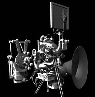


I now had something I could view from any angle, and I could also light it in any direction. This model was invaluable reference material. And from this model I created constructional views. I asked Mark to come up with a list of nonsense names for each component of the Noise-a-matron, and I came up with a few of my own, all just for fun.


The next step was to piece together the rough in photoshop. Firstly, I had to get the angle and lighting right on the Noise-a-matron...

I then incorporated all the hand-drawn aspects...

Once the rough was approved, and an Arts Queensland Grant secured, in 2005 I commenced painting.

I used oil paints and collage for the whole book. It took me 9 months to complete, usually working 4-5 days/nights/mornings a week. I love working with oils for what they can do, but the fumes become intolerable before long. I was working and sleeping in the one room in a small flat at the time, so I'm sure this book has cost me a few years of life.
I have so much more to say about Circus Carnivore, but I'll save that for another post.


 and
and  , so I pushed to keep it in a swamp. Now that I've done a swamp book, I'm less inclined to do another one. If I do, it has to be far different from this one.


