Welcome to my blog! Here you'll find many samples of my finished art, conceptual work, unpublished material, and other miscellaneous jobs. You can find a complete list of my published books at this link.

I currently have signed copies of THE GREAT MONTEFIACO, WHACKO THE CHOOK, THE PUMPKIN EATER FROM PONDICHERRY, and THE SHIKKER COLA COWS available for purchase. For more info, please contact me at whackothechook@internode.on.net


Monday, December 13, 2010

COWZAT! - Character Development

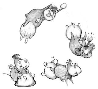
Some very early cow concepts for Bruce Atherton's Cowzat!
I would have found these difficult to have playing cricket, so I came up with a refined, more practical design. I began with a basic template that I used for most of the cows...

From there I set about creating unique, defining characteristics for each.
Two breeds of cows are represented here, Jerseys (which are mentioned in the text) and Friesians/Holsteins. I initially had the two teams a mix of each, but decided to use their distinct markings as team colours, which made more sense.
There's an awful lot in a name. I can come up with many ideas from a name alone, especially if those names are as inventive and fun as those in Bruce's text. Because there is little in way of character descriptions in this text, I was free to flesh out each character visually, with just the names as starting points.

There's team captain number #1, Jezzabel:
The only description of her in the text is she's got a hat. A baggy green seemed the obvious choice. I gave both team captains bells too.

Team captain number #2, Floppy May:

In my original design for Floppy, she had an abnormally large udder, twice the size it is in the finished book...

I was talked into giving her an udder reduction by my editor, a move which was supported by my wife who was also slightly troubled by it's enormity.

Next, there's Daisy Lou:


With a name like that, Cowboy boots and a straw hat seemed appropriate.

Jenny Bramble Rose:


She's a key character in the book. A messy 'bramble' of hair adorns her head.

Lady Daffodil:

This name sounds aristocratic and snobbish, so she always has her nose in the air and glowering.

Marjorie:

My grandmother's name is Marjorie, so this is an affectionate nod to her. The hair and glasses are reminiscent of my grandma's hair and glasses in the 1960s. I guess this cow is also a tip o the hat to Gary Larson, there's something Far Side-esque about this character and her name.

Pattie Pie:

Branching away from the template with this one. You just couldn't possibly have a slim cow with this name...

Aunty Moo:

The senior citizen of the group.

Jill:

With a name like Jill, this character could be anything really. So I decided to make her young and small, to contrast the very old Aunty Moo.

Twinkle Toes:

The less said about Twinkle Toes the better...

Cowzat! is out now in Australian bookstores.

Monday, November 8, 2010

COWZAT!

COWZAT!, written by Bruce Atherton, and published by Windy Hollow Books is out now apparently.
I'll talk more about this book later...

Wednesday, September 22, 2010

Toilet Humour continued...

Here's some slightly better photos of the toilet door commission. Enjoy...

I like the grainy texture of the timber, it was a good surface to paint on. It also added an aged look, almost like cracking paint, which was all the more befitting of the subject matter...

Painting is a peaceful, cathartic process most of the time. Makes me wonder why I don't paint more often.

Sunday, September 5, 2010

Monkey Bouquet


"Peoni's may be out of season, but monkeys are all year round!" is the message on the back of this Valentine's gift for my wife (then fiancee) in 2007. She said she hated it at the time, but it's been on display since, so it can't be that bad.

Thursday, August 26, 2010

Toilet Humour

Today I worked on one of the more unusual commissions I sometimes get asked to do.

A friend, and avid collector of original artwork and cartoon memorabilia, had two panels on his toilet door he wanted me to fill.
Thank god the door swung outwards! I didn't fancy a day sitting on the can to paint!

I was free to come up with whatever I wanted, which is sometimes tougher than if I was given some kind of guideline. I could have done something completely random, but typically these sorts of pictures just end up looking grotesque, and I figure most people wouldn't want to look at something too grotesque whilst taking a dump. So I decided on something a tad conservative, something 'classic', though with my own spin on it...

The top panel is titled 'Fowl With A Pearl Egg Ring' (based on 'Vermeer's Girl With A Pearl Earring', obviously), and the bottom panel is 'Son Of Whacko' (Magritte's 'Son Of Man'). Both these pictures are not entirely new, I've had these floating about for a few years. I did semi-photoshopped versions of them a few years back when I was working on Whacko The Chook with Mark Svendsen:

They were done merely for my own and Mark's amusement. But this commission was a good excuse to do proper painted versions of them.

I got these done in one day, I didn't think I would. I intend going back to add a varnish over the top, and when I do I'll get better photos of them using a better camera...

Monday, August 23, 2010

Tuesday, August 17, 2010

CANCELLED, Part III

In late 2005 I was sent a text "NOAH'S OCEAN COMMOTION" by a publisher in the UK. About this stage I was in the process of sending out my manuscript for WHO FLUNG DUNG? to various UK publishers, and this was one of them. So I think when they saw my work on that, they decided I'd be suited to this text. I actually don't know who wrote it, I was never told, and I've never seen it published since (not under this title at least), so if anyone has any information in that regard I'd be curious? It was quite a fun story, so it'd be a shame if it was canned.

My concepts started with the three main characters, a Lion...

A Gnu...
And Noah...

The feedback to these was they weren't cute enough. They thought they were too stylised, and not soft enough in their features (again, had they researched my body of work...). So I went about 'cutifying' them further...

I don't think I'd gone quite this cute in my work up to this point. My wife (who is barometer for everything I do) thought they were adorable, but alas, again, they weren't cute enough. I wanted to secure this job, as I was desperate for work, so I gave it one more shot...

It still wasn't right. I honestly couldn't work out what they were after, but it became clear they were wanting a style that was not my own. The characters were starting to look like plush toys by the end, and this is as far from my established style as I was willing (and able) to go.

It was a mutual parting in the end. Subsequently, barely a week later, Meadowside Books caught me on the rebound and contracted WHO FLUNG DUNG?, which has been my biggest success so far. I shall discuss this book in a later post...

'Noah's Ocean Commotion' wasn't a complete waste, I managed to recycle my initial Gnu design into Who Flung Dung?...

Thursday, August 5, 2010

FOO WAS HERE

Here's a portrait of our beautiful dog "Foo":
This was a Christmas present to my wife. This is Foo with all his favourite things — food, Kong, lead for walkies, his squeaky rubber chicken and chicken leg, 'Wilson' (the ball he stole from children at the park), and his blanket, otherwise known as the 'Boochu Shroud'. Not forgetting his awesome tag, made by our good friend. Lastly, his flea shampoo is tucked away in the background — that's his least favourite thing!

Foo is a 50kg Irish Wolfhound x Bull Arab. He's certainly got a different life to his pig-hunting relatives in the country. We spoil him rotten!

The name 'Foo' might be familiar to cartoon buffs. It originated in the cartoon strip 'Smokey Stover'. Cartoonist Bill Holman frequently used this word throughout his strips, but never revealed it's significance or true meaning to it's readers. Thus, because it was unexplained, it was often used to label something that couldn't be identified — eg. the 'Foo Fighters' of WWII. Smokey Stover was a popular strip with other cartoonists and animation directors, so the word 'Foo' was often referenced in Warner cartoons. It was also brought to my attention that in Australia during WWII, and for some time after, "FOO WAS HERE" was common bit of chalk graffiti:

It's origin here is unclear. So, all round, the word 'Foo' denotes mystery. And it felt like a good name for a dog.

Here's Foo in action during last years dust storm...

Monday, August 2, 2010

CANCELLED, Part I

In 2005 I was given a paperback manuscript with the working title 'Nathan, Marvy & Pogue', written by children's author Odo Hirsch. It was later renamed and published as 'The Book Of Changing Things'.

Often I get asked to submit samples for a project, and for one reason or another the publisher may decide not to use me as an illustrator. This can be a little frustrating, particularly if you've exhausted a lot of time and effort reading the text, taking notes, and creating concepts. More often than not you won't get paid, and without a contract a publisher is not obligated to pay you, it's just a gamble you take as an artist. Allen and Unwin on the other hand were very kind enough to compensate me for my time, without any prompting from me. This is rare.

The follow concept sketches are for the above mentioned book, and have never seen the light of day...

I had a lot of trouble with this squirrel character. I just couldn't get him right. The publisher wasn't really happy with him either I think. They thought he lacked personality, and they were right. I attempted to give him more versatility, but my frustration comes through here I think...

An earlier version, which was deemed too cartoony:
More characters...
This one's my favourite. I love drawing teeth and gums, and sinewy gullets...
 Unbeknownst to me at the time, I think I was just one of several illustrators they were 'interviewing', so to speak, for the job. I was sad I didn't get it, but at the same time I breathed a sigh of relief — it was a daunting text to illustrate. There was an awful lot happening in the story, and everything was so detailed and vividly described, and while it was my kind of story, it would have been a long-winded headache. The job in the end went to Inari Kiuru, who I think did a brilliant job. Her style brought a real dreaminess, almost hallucinogenic quality to it, which is very much in sync with the story. It's a really nice looking book, beautifully designed and presented. See her samples here!

It's always interesting to see how another artist interprets the same text; I've thought it would be a fascinating experiment to take a picture book text, preferably something obscure or nonsensical, and get a dozen illustrators, all uniquely different from each other, and have them go away and illustrate it how they see it. Has it already been done? Probably, I don't know...